UX/ UI & Product Design
Here’s what I can do for you.
Product Design
UX Case Study
Case studies for spec sites with live interactive high fidelity prototype.
Step 1. Understanding the User Behind the Oven: Empathy-Led Research for a Non-Tech-Savvy Clien
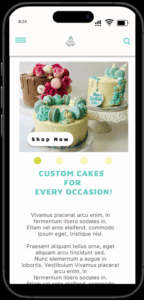
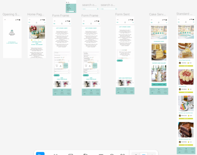
Project 01 | Jenny's Cake Emporium | Crafting a Sweet Digital Welcome for a Personal Touch

A Bespoke Cake business looking to build a website to market their business and gain new business. To reach new audiences and advertise her services in a different way as she currently uses word of mouth, cake fairs, relies on referrals and Facebook to get people to her store.
Understanding the User Behind the Oven: Empathy-Led Research for a Non-Tech-Savvy Client
- Determine users needs, pain points
- Understand business objectives & brand voice
- Comparative analysis against two other bakery websites
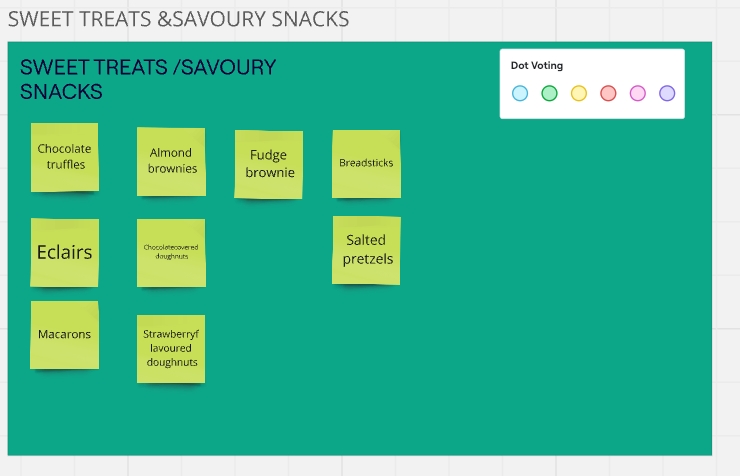
Research Insights
- Owner wants to keep personalized experience & in person consultations to build relations, she mentioned the love of teal and sunflower yellow and an elephant motif that is sentimental to her baking journey.
- Participants had similar approach to product grouping, appreciated organized information.
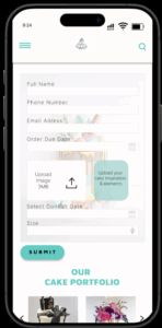
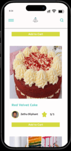
- Use if Images, Simple navigation and mobile accessibility, Location information must be readily available.
Step 2. From Flour to Flow: Structuring Simplicity for Seamless Browsing
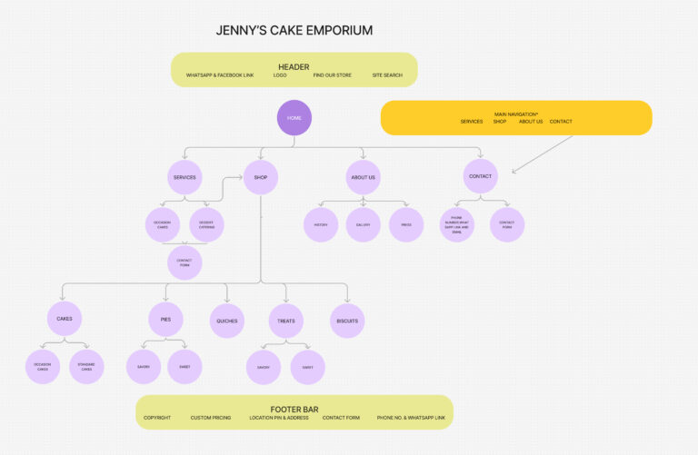
Began the process of organizing information based on insights from the research to develop a prototype, keeping business owner and the user in mind and worked on the vsiual design. Design assets included:
- UI
- Typography
- Font
- Navigation
- Icons
- Colour Theory
Step 3. Whisking Up Delight: Mid-Fidelity Designing to Visual Language as Inviting as Jenny’s Cakes
User Map to Mid Fidelity WireFrame
- Annotations
- Mid fidelity wireframe
- Ideation & Information archistecture
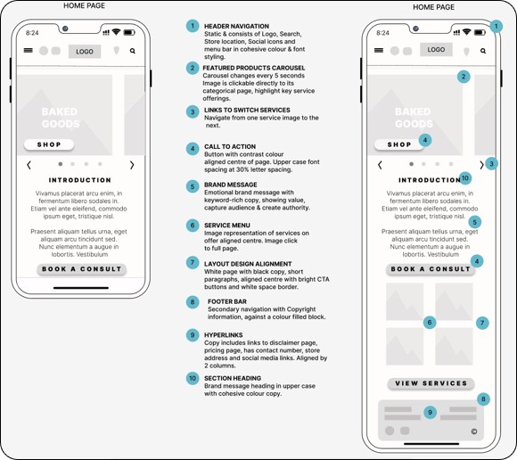
Step 4. Sketching Sweet Interactions: Prototyping with Accessibility in Mind to Validating, Testing & Iteration
Entered into usability testing on Maze.com, drafted a A/B Test with a mission to accomplish, testing multiple elements of the prototype.
- Multivariate Test elements included Video footage with audio, comparison test with opinion scales, open end questions and scroll paths
- Test had 3 participants
- Multivariate Test for the Home Page Heading
- Second test of CTA Button
- Test had 3 participants
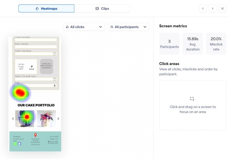
The test report was positive and showed that participants appreciate easy and simple navigation and clear CTAs. The additional use of images of all the cakes also made for easier experience when shopping for variety online.
- 100% Users would use this site again, indicates success
- Tests showed users followed expected paths with 75% success
- CTA buttons are functional & elicit desired action
- Testing one element at a time worked for clearer test results.
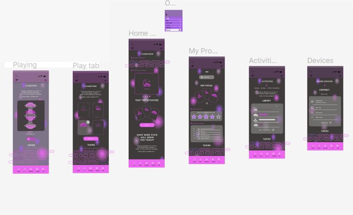
Project 02 | Resonance: Designing a Mindful Soundscape for Sleep, Focus, and Inner Calm
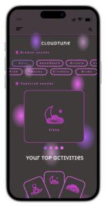
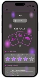

Project 02 | Sleep Music App for concentration
Project 02 | Sleep Music App for concentration
Tuning Into Tranquility: Researching the Rituals of Rest and Focus
The challenge was to design and build a mobile app to helping individuals prioritize their mental wellness, by playing calming sounds chosen for their ability to relax, inspire, revive and focus.
Mapping the Mindful Flow: Structuring Sound for Seamless Exploration, Aesthetic Calm Meets Functional Clarity
My role was user research, ideation, information architecture, user flow, colour schemes and typography, icons with style guide, low fidelity wireframe to high fidelity prototype, usability testing and design finalization.
Research methods to approach project included card sorting and interview with potential users to understand their pain points and expectations of an app like this. Thereafter I went into ideation, sorting together the flow and user map for one to get from a to be. This was followed by a mid-fi wireframe for a cleaner layout.
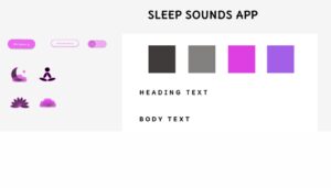
Once that was satisfactory I went into colours and given that its a nighttime app usually, the display needed to be dark, elements needed to standout. The colour set was decided and fonts set. Copy was also considered for usability and comprehension.
The desired result was a relaxing, low brightness and simple interface, some customizable functions to make the experience personal, and a flexible selection.
Sketching Silence: Prototyping Peaceful Interactions for Every Mood
Project 03 | Stop The Spread of Misinformation on Social Media
Step 1. Research
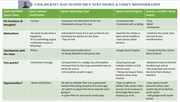
The scope of the project presented entailed: Finding a solution to stop the spread of misinformation and fake news that happens via social media
Research Objectives included:
- Understand the source of misinformation & how it spreads
- Interview Potential users & Stake holders
- Determine user journey, pain points & needs
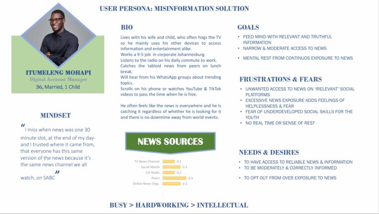
- Develop a persona based on the research done.
Step 2. The Problem
Defined the problem statements as:
- In our modern day, mindless engagement with disinformation on social media is fueling a bigger problem pertaining to the irresponsible use of technology in reporting news and the harmful consequences of this continuous consumption.
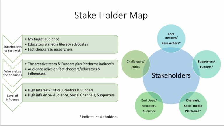
Identified stakeholders and their level of interest, the decisions they’d make and who I would test the solution with.
In the workshop we focused on and asked 2 main HMWS to generate ideas to tackle the problem and find as many solutions as possible
- How might we lessen the volume of unwanted news that causes Itumeleng to feel fearful/helpless?
- How might we help Itumeleng feel socially included without perpetuating fake news stories?
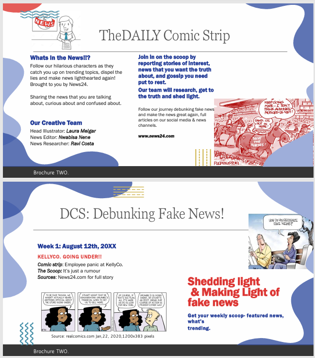
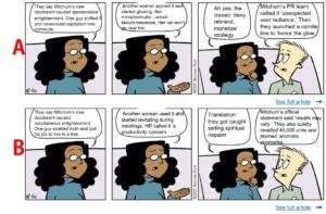
The strongest solution that came out of this was the below:
- A trending news focused comic strip published weekly, online. It is a sharable jpeg, implementable across various social platforms and linked to reputable news networks.
Step 3. Testing The Solution
Solution works as a social media news feature comic strip that targets misinformation and disrupts by creating satirical content focused on highlighting trending lies and sharing reliable resources for factual information.
For this I chose to conduct an A/B test to find out if participants comprehended the satirical content and which type of humor resonated with them the most. I asked questions about the cartoon strip and its commentary to gauge understanding.
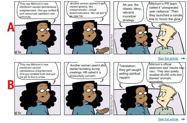
The test results and success probability. Lorem ipsum dolor sit amet, consectetur adipiscing elit. Ut elit tellus, luctus nec ullamcorper mattis, pulvinar dapibus leo.
Insights of the tests were:
- 2 would tap laugh & 2 would Share
- 50% Comprehension of information
- 50% split between A/B
Which showed a positive towards comprehension, viability and the CTA was appropriate/relevant, giving the desired action result from participants as they would share, react and associated the content of the strip with current affairs.
- FEASIBILITY, DESIRABILITY & VIABILITY
Whether you’re a startup, a creative entrepreneur, or an established brand looking to evolve, I’m here to help you design with purpose and impact.
Ready to work together?